Working with photographic prints for billboards I used this blueback paper a lot. While working with prints on this paper i started to appreciate the blue color more and more. The color is brought to the paper on a quite inferior way, it just has to be blue not matter what. By this inferior way of producing the blue ink gets a kind of vibrating feel over the surface. For me this aesthetically experience was leading to use the material for this monochromes. Next to this I liked to place it on locations where normally advertisement prints are placed so the platform as such is displayed as pure as possible.
--- categories: archive, worksTurn Blue, 2015
-
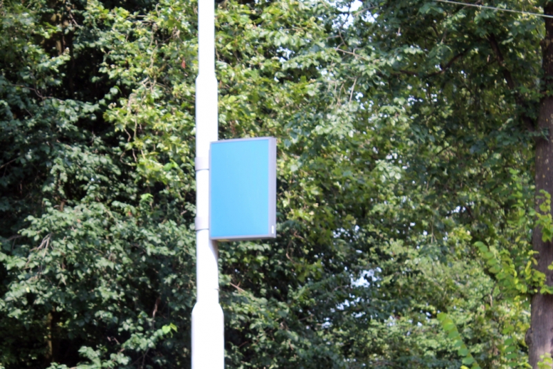 fig.1 - Turn Blue, Wouter Huis, 2015
 -
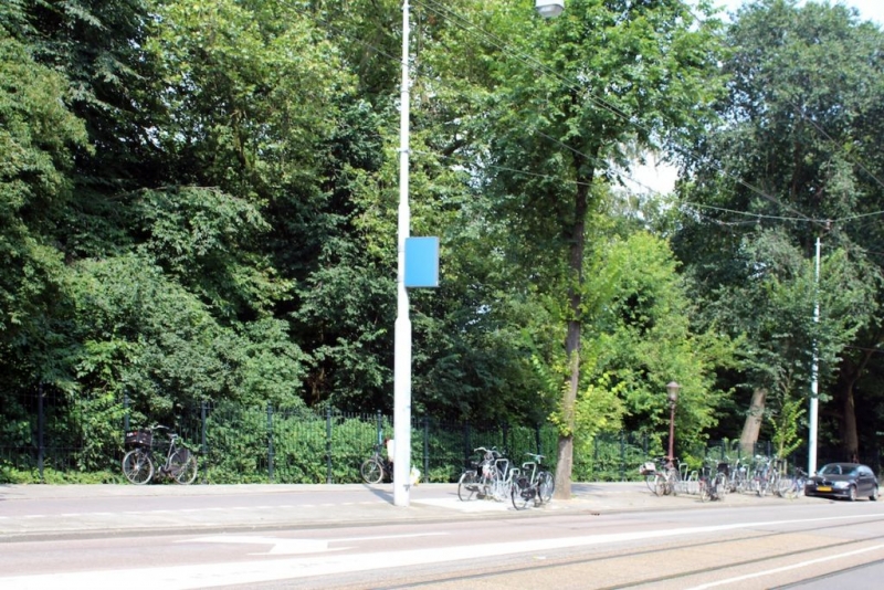 fig.2 - Turn Blue, Wouter Huis, 2015
 -
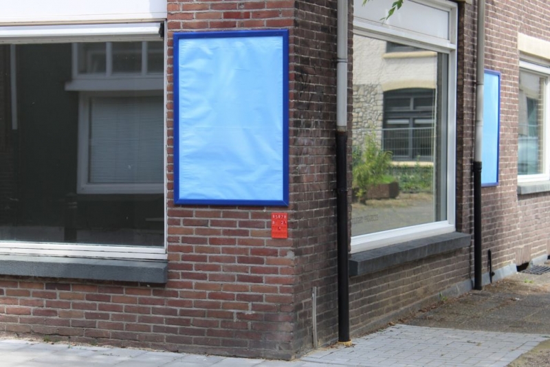 fig.3 - Turn Blue, Wouter Huis, 2015
 -
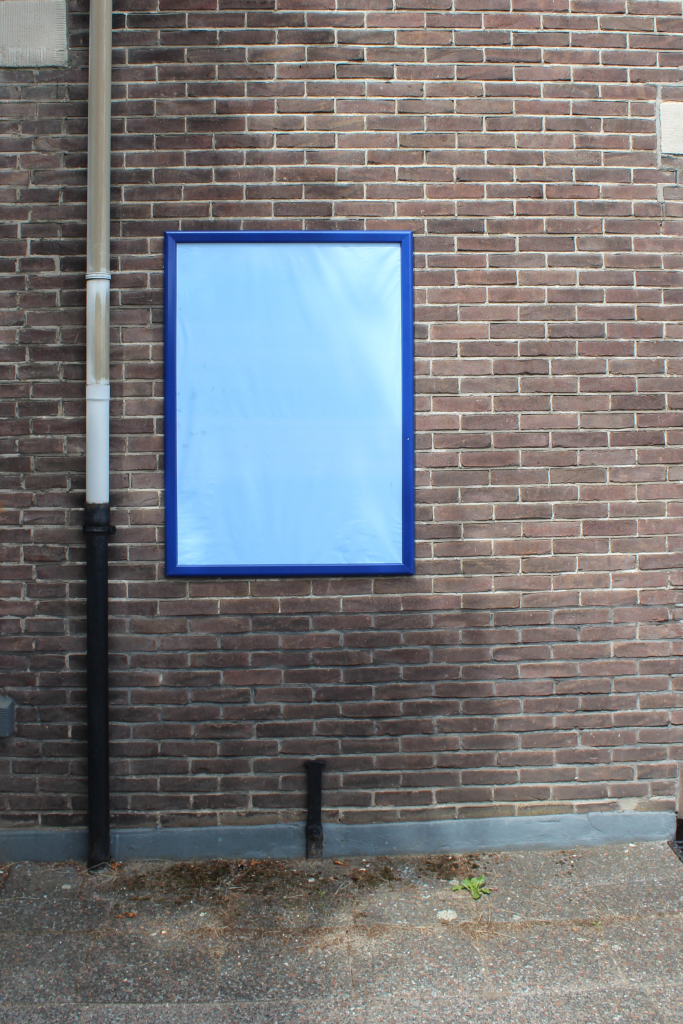 fig.4 - Turn Blue, Wouter Huis, 2015